


atrip
Atrip specialize in providing architecture, art, culture, design and lifestyle tour destinations both for professionals practitioners as well as students. Their trips provides you a chance for self-discovery in the creative world as well as an opportunity to live like a local. Unlike the usual tour & travel company that is fixated with their pre-plan timetable and schedule, Atrip provides a more flexible schedule for you to fully experience the trip.
We’re tasked to create an identity that will convey their message as well visually appealing to their majority audiences that comes from creative-background.
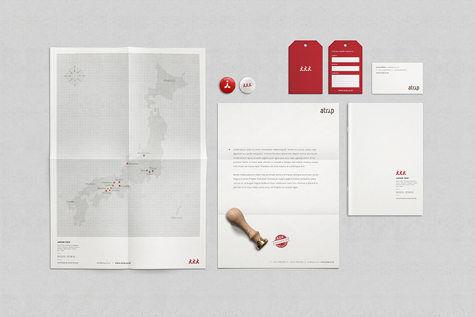
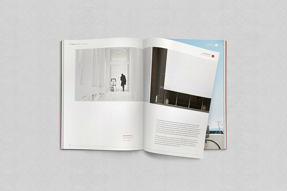
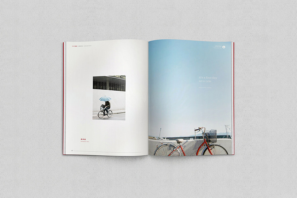
We created a visual identity system that introduce the concept of “wabi sabi travel”. The logotype has a humanoid icon – taken from the lowercase “i” to symbolize the “personal experience”. The color palette is muted dark red, white and grey further reflecting their modest and relaxing manner of touring. This almost monochromatic color palette sets Atrip apart from its competitors dominated by bold colors and transport-based objects.
Category
Art Direction, Brand Identity, Print